Tuesday, April 30, 2013

Spontaneous Designing

Twine Interiors

Being spontaneous is a good thing.  It means you don't take things so seriously and you go with the flow.  Or you could be like me, being spontaneous is only under the influence of too many margaritas or being an emotional basket case (once a month).  I have made many not-so-good decisions in this state.  It's that feeling you get when you are in desperate need of a change, any change and you focus on something like...oh let's just say.... it's time for a new hair style.  BANGS!  Yes, what a great idea!  Who needs a hair stylist, I can do it myself!  Snip...Viola!


Then come the tears, sobbing...what have I done?!?!  Yes, this has happened way too many times in my life.  You'd think I would have learned the first time but that crazed state I am in is so powerful that all reason goes out the window.  So, it's the same as "let's paint the living room purple"... tomorrow.  I just have to say Noooooo....Don't do it.

Here's some advice to stop or rather curb, the spontaneous desires to redecorate (or cut your hair):

Scenario:
It's Friday night and you are exhausted from work, you think to yourself as you watch the movie "Father of the Bride" for the 90th time, I sure would love a yellow living room like that.  Let's paint the living room yellow.

Father of the Bride Living Room- soft yellow
You get up early, head to Starbucks, then to the paint store.  That yellow looks good, I'll take a gallon.  At this point you have no idea how many gallons you need, there has been no measuring, no thought nor research.  You get home, move the furniture and start painting.   Lunch time and then the second coat.  All done by dinner!  You breathe deep and bask in the fruits of your labor.  Sunday morning you wake up and realize you painted your living room Spongebob yellow.


While this isn't really permanent, it can be painted over, however, who has time to do that (again) and now you have to live with the Spongebob yellow until the next spontaneous desire to paint happens or until you actually plan it.  It's like waiting for your bangs to grow out.

Step 1 -Once the thought comes into your head to do something permanent or semi-permanent to your home or your body- question that thought.  Do I really want a yellow living room?  Do I really want a change?  Maybe count the days of the month.  Have I been watching too much HGTV? Have I been on pinterest too much? Then sleep on it.  If you still want to do it in the morning then start planning (DO NOT START DOING).  In the hair scenario: Put down the scissors, instead make a hair appointment, research what styles will look good on you, ask friends for advice.  This will give you plenty of time to avoid a hasty decision or to be committed.  The same goes for painting or buying a large piece of furniture.  Plan, research and get advice before doing.

Take this weekend of spontaneity and desire to change and use it to your advantage.
•Measure your room so you know the amount of paint you will need
•Go to the paint store and get some paint swatches


•Google those colors you picked up- many times people will name the paint color in the photos so you can really see what the color will look like.  Try Houzz and Pinterest for ideas.
•Email your friend or ask your family what they think
•Go back to the paint store for small samples or quarts
•Paint 2'x2' section on the wall (remember now you are committed unless you want a square painted on your walls)


•Sleep on it
•Sunday- go shopping and buy the supplies so that next weekend you start painting

Step 2 - Let's say this is your only weekend and you really, really want a change and Step 1 isn't working for you.  Do something less permanent....
•Go buy some pillows, accessories, art (less expensive items that can be returned or lived with for a while)
•Rearrange the furniture you have
•Rethink how you are using the rooms in your house- maybe you want the dining room you never use to be the library
•Paint a canvas instead- make your own art.
Paint Sample Art
•buy flowers and do your own arrangement


Try a terrarium!  Planter by Score + Solder
•Bake or try a new recipe- make sure you have a plan to give what you bake away or you might eat it yourself

Sweetapolita Swirl Cake
Sweetapolita has great baking recipes and how-to's

Step 3 - Sometimes these moments of spontaneity are really meant to avoid something you don't want to deal with.  The very thing we don't want to do is the very thing we should do.  Are you avoiding something?  Maybe you should have that conversation with someone, clean your house, pull weeds, or exercise instead of avoiding it.

I'm trying to save you from making a huge mistake like this.

~ Brandy


Friday, April 26, 2013

Guest Blogger: Jen from Purse and Clutch


I remember in college taking an art history class. While I'm sure everyone had a similar course requirement, being in the science department meant that they put their own spin on this course. Meaning, of course, that we looked at the history of art through the lens of what was happening simultaneously in the worlds of math. And I loved it! It is so inspiring to me to examine a trend through the eyes of a seemingly separate industry. New patterns and idea emerge that would never normally surface. 

This is true for me within the world of interior design and fashion. Clearly there are color trends and styles, but looking at one through the lens of the other can bring new life to ordinary objects. 

As the owner of Purse & Clutch, a handmade and fair wage handbag business working to help create sustainable jobs for artisans in developing countries with limited opportunities, I have the oh-so-tough job of researching current fashion trends (note sarcastic tone!). One trend that I've really been enjoying watching evolve with the seasons is color blocking. My love of saturated bold color combinations had definitely crept into my living room, especially on my bookshelves.

I collect books. While this can be a messy, disheveled look when done haphazardly, grouping books by  similar colors and adding similarly colored accessories can really streamline a room. Check out some of my favorite parts of my apartment: 

Spring Interior Design Trends

Color Blocking Design Trends

Designing with Vogue Magazines

Yellow Book Collection

So where to start? See what you already have - I only intentionally collect yellow books! The black and blue collections were just by chance. Etsy has some really great stores that will actually sell vintage or vintage-looking books by color. Thrift stores, flea markets, and garage sales can add to your collection without costing you more than 25 cents if you're picky. Don't forget to look at the colors behind the dust jackets and if you're hoping for this to be a financial investment into possibly collectable books, start a drawer where you keep the dust jackets safe and sound until you're ready to resale. 

I would love to see your take on color blocking in your home, or in your wardrobe! You can connect with me on Twitter, Facebook, or Email


Wednesday, April 24, 2013

Hallway Design Ideas

twine interiors
Great place to display kid's art, the mirror is a great focal point and the horizontal stripes in the rug make the space not seem as long
Hallways are sometimes put on the bottom of the list to decorate.  I know it's on the bottom of my list.  They are a means to an end and not usually a place where you spend time but that doesn't mean you should neglect your hallway.  Make your hallway an uplifting space instead of a bore.  

There are 3 things to consider when designing your hallway besides walls and floors;
1 - Lighting - You need enough light so that it doesn't feel dark and scary.  Add wall sconces, they really add character to a space.

2 - Art - This is the perfect space for a gallery!  It can be family photos, paintings, kid's art, storage, mirrors, etc.  And adding 3-Dimension objects will create a dynamic space instead of just a hall.

3 -  Focal Point - You need a focal point at the end of the hall, something to catch your eye!

Here's some great ideas to dress up your hall...

twine interiors
Bright fun wallpaper and Sconces
 Notice the mirror and console are the focal point of this room.

art gallery, hall, decor
Love the surf board hanging from the ceiling
 This is a great example of all 3 - lighting, art and focal point.

twine interiors
Sculptures displayed on pedestals

twine interiors
So glamorous!
 The mirrors really make this space seem large.

decor hall, ideas
The mirrors help expand the hall's width

frames red
Love the red frames!

modern
Simple art display

Make your storage more like art

This is a fabulous focal point

decor, casual design
Add book shelves to your hall

modern, hangers
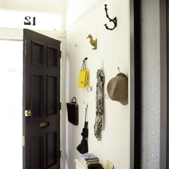
Love the hangers!

creative ideas
A collage of hooks makes a great display

bright color
Fun wall designs

Paint your doors a color instead!

Below is my back hall to my garage.  My family is the only ones that use this hall.  It's depressing to walk through.  So, it's time to make this ugly, boring space beautiful!  Here's my plan...

Before Hallway

Stay tuned for the after....

~Brandy

Friday, April 19, 2013

How to update a 70's Bathroom

twineinteriors, 70's bath, remodel, design

Are you tormented by dated wallpaper, fake wood paneling, chained lights, glitter popcorn ceilings and brass?  You must be stuck in the 70's!  You need a quick and easy update to make your bath bearable to walk into without thinking you are in an episode of Three's Company? (I know, I just dated myself)  Here's some ways to update that will be easy on the budget...

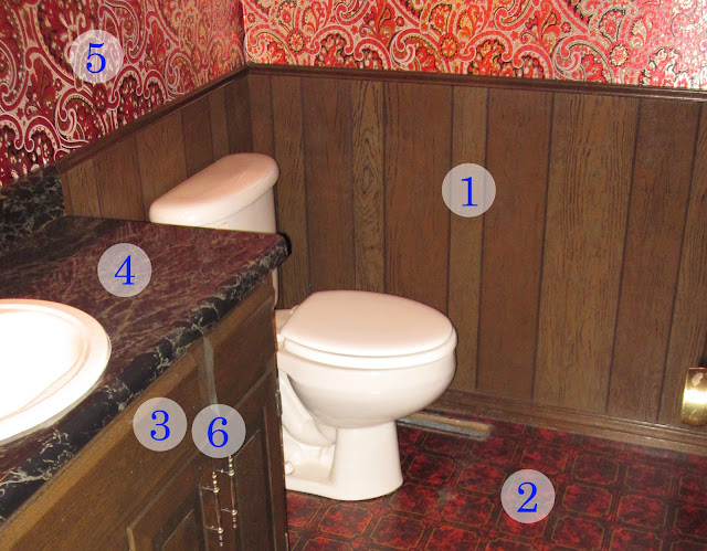
Typical Examples of the 70's Bathrooms

wood paneling how to
Typical 70's wood paneling and wallpaper

wallpaper, how to
Crazy Wallpaper

twine interiors
This bathroom is fairly calm but the hanging
lights give it's age away

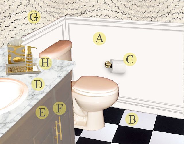
This is what your bathroom could look like!

twineinteriors, elegant remodel, bath
Elegant and Classy!
Here's some great ways to update:

1 - Remove or cover that ugly fake wood paneling!!  It is the worst invention ever.  There are several DIY sites that say to fill in the cracks with drywall mud and paint it but I am a firm believer that this doesn't work.  It takes a lot of effort to do this process and eventually the mud will crack and fall out.  It's better to cover it or remove it.

Twine interiors
DON'T DO IT! (Example of filling the cracks in wood paneling)
A - Wood Paneling is a great option if you just want to cover it.   

tradtional bath design, green walls
Beaded Board Wainscot (Love the green walls!)
Beadboard comes in sheets so you can nail and glue it right over.  Add base and chair rail trim.  An 8'ft long section is $50.

Example of Board & Batten type paneling
 Just attached a 4'x8'x1/4" sheet of plywood and attached 1x2 or 1x4s any spacing you want just make sure to cover the seams.  A paint grade plywood sheet is $13.

classic design
Classic
Benjamin Moore, Modern, Classic design
Paneling doesn't have to be white

Modern wainscot
Paneling doesn't have to be traditional

Remove the fake wood paneling and add sheetrock.  Finish and paint or wallpaper.
Elegant bath
Use a chair rail to cover any wall depth differences
Or put green board (backer board for tile) up and tile!
classic bath design
Love a subway tile wainscot!


2 & B -  Usually the 70's floor were sheet vinyl.  Remove it or if it is stuck pretty good and not peeling up then put down self stick floor tiles over it.  They are fast and easy to install and only $1 a square foot.  Obviously a better option is to have new tile floors installed, so if you can afford it ...go for it!

3 & E -  70's cabinets...Oh boy, where do I start.  They cheaped out.  Most likely if you have 70's cabinets they are veneer or plastic over particle wood.  Paint them or replace the doors with new ones!
Think color, not just white!  
metallic cabinets, modern design
Still keep that 70's glam with a modern take on cabinets.  
4 & D -  Replace those plastic laminate countertops with stone, or if you want to splurge buy a vanity sink unit.  I love a Carrara marble (shown in picture above) but you can get any stone.  Look for remnants if you have a small vanity.

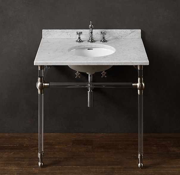
Here's some vanities you can replace that old cabinet with....

Modern and traditional bath design
Stone & Chrome Sink Vanity
Chrome, marble, bath, vanity
Restoration Hardware Gramercy $2,195
Bath, powder, design
Modern Vanity & Eclectic Mix
5 & G - Dress up those walls!  Remove the wild and most likely flocked or metallic 70's paper and either paint or put up some new wallpaper.

Warm, design, interiors
Great example of a simple & traditional bathroom (minus the fern)
There are so many fun wallpapers!  Paint a stencil or use removable wallpaper.  

Sexy Hexy by Chasing Paper
6, C & F - Update with new hardware.  This is the easiest update. Currently, gold is all the rage in finishes but if you aren't that trendy or it doesn't fit your style, stick with nickel, brass, stainless, or oil rubbed bronze. A satin finish is best because polished shows everything and scratches more easily.  The least expense is chrome (which is a classic look)!

Kohler Vibrant Modern Brushed Gold... Ohhh...Ahhh...Looove!
7 - Replace that chained pendant that hangs from a ceiling hook with a wall sconce.  

modern light, chrome
Horchow Edison-Type Wall Sconce $195

transitional
George Kovaks Rectangular Bronze Wall Sconce (comes in chrome and brass too!) $117

8 - A new mirror.  This is the most important change because it is what you see the most, besides yourself of course!  There are so many mirror fun mirrors, don't be afraid to try something new.  You can even spray paint the one you have to breathe new life into it.  Try layering mirrors especially if you have a plain plate mirror now.  Hang another mirror in front of it using fishing line from the ceiling.
elegant bathroom design
The decorative mirror dresses up this plain plate mirror
framed
Layer two framed mirrors
H - Add some life to those counters with new accessories.  Your toothbrush will thank you!
bathroom
Horchow Waylande Gregory Porcelain and Gold (sorry these are expensive but I couldn't help myself)
9 - Under no circumstances should you have a toilet lid cover nor a rug that wraps around the toilet; it's just unsanitary.

Do you have any additional ideas? email me your 70's updated bathroom pictures ~ brandy@twineinteriors.com